My portfolio
01
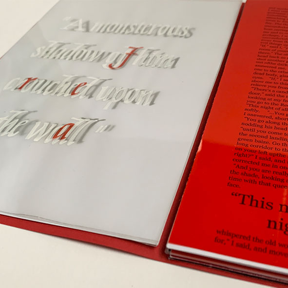
The Red Room - EDITORIAL
For my book, the typography throughout represents this growing sensation of fear. At the start, the typography is plain and ledgible, however the further on you go through the book, the text becomes more illegible as the fear increases. I also created layering throughout my book. This was achieved using tracing paper and acetate. The use of layering creates ‘a fear of the unknown’ as the text cannot be read without all layers fitting perfectly on top of each other.


02
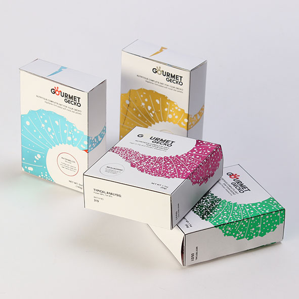
Gourmet Gecko - PET FOOD PACKAGING
I decided to choose reptile packaging for this brief. While researching reptiles, I was drawn to the beauty of their delicate scales, patterns and textures. The USP for my brands packaging is a premium range that offers amazing quality ingredients for your gecko, I wanted my tone of voice to replicate this feel so used foiling for the main design.
03
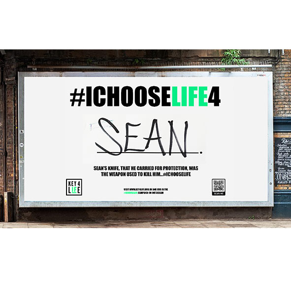
Key4Life - CAMPAIGN DESIGN
The campaign encourages young people to choose life and drop the knife because there are so many things to live for. It encourages them to think of these reasons and act on them.
The posters have the hashtag ICHOOSELIFE and then someones reason for why they chose to live and ditch the knife. There is also a little knife crime statistic that links to the reason they choose life

Let’s Start Something new
Say Hello!
Excepteur sint occaecat cupidatat non proident, sunt in culpa qui officia deserunt mollit laborum. Sed ut perspiciatis unde omnis.